The moment anyone raises the topic of brand consistency, we have to talk about Apple. It’s inevitable. Apple is now synonymous with everything “brand.”
And to be fair, Apple has nailed brand consistency, from visual branding to messaging.
Apple is like that friend who has the uniform wardrobe, but it’s a really sexy uniform that no one else can pull off. You never get tired of it, but it’s never that different.

Or, we think about Starbucks, which hundreds of millions love for its consistency. The brand, the experience, the product — it’s always the same. And it hits an emotional spot for cafe-goers.
But is brand consistency only important for behemoth brands? Or is it important for startup and growth brands, too?
In this post, I’ll share examples of DTC brands that successfully employ consistency to get an outsized impact on their marketing efforts.
Specifically, we’ll talk about how brands use repetitive concepts in their messaging and how that repetition of ideas could increase conversions.
Why Brand Consistency Matters
“The most obvious benefit of brand consistency is brand recognition. Every business should strive to be immediately recognizable by their target audience.
Not only does it help to build a strong association between your core messages and values and the visual elements of your brand, but it also sets your brand apart from the competition – a particularly valuable perk in highly competitive, saturated markets.” — What is Brand Consistency (and Why Does It Matter)?
Why does brand consistency work?
In Beloved Brands, Graham Robertson explains:
“Through the eyes of consumers, brands start as complete strangers, randomly purchased a few times without much thought. They become acquaintances, and when the brand successfully delivers on expectations, they move into something similar to a trusted friendship.
As the consumer sees a consistent experience and trust, they begin to open up, and the romance begins. The consumer allows their emotions to take over, and without knowing, they start to love the brand.” (p. 43)
That emotional connection, Robertson argues, is forged through a brand idea. Namely, it’s forged through a single-minded brand idea.
“The brand has to show up the same way to everyone, no matter where it shows up. Even as the brand leader expands on the idea, whether telling the brand story over 60 seconds, 30 minutes or over the lifetime of the brand, it must tell the same story.” (Graham, p. 15)
Why the same idea? For one, your consumers won’t give you unlimited attention to express every idea you can possibly claim. But also because your brand needs to be knowable (and definable) to be lovable.
What Brand Consistency Has to Do With Conversions
We care about consistency because, done right, it’s a conversion strategy.
Consistency in your brand message can lift conversions. As we said in this post on brand messaging, there are at least “three important psychological reasons to be more consistent:
- Effective frequency: it can take up to 13 repetitions of an ad to get a response
- Mere-exposure effect: audiences develop a preference for familiar messages over novel messages… up to a point (the habituation-tedium theory is a strong case for being artful in your repetition)
- Frequency illusion or bias: audiences notice and pay attention to what they’ve seen before (also called the Baader-Meinhof Phenomenon)”
Yet, brand consistency alone is not enough to boost conversions.
Consistency must be built on meaningful customer insight. There’s no point in being consistent with a message unless it’s the right message.
So, how do you get that insight?
“Conduct qualitative research to understand what motivates your customers, and then work to make that a consistent message across your marketing.” — How to Radically Stand Out with Brand Marketing, CXL
In other words:
- Find a brand idea that converts (through qualitative research)
- Create a message that conveys that idea (through conversion copywriting)
- Express it consistently across your marketing
It’s a misconception that experimentation and brand consistency are at odds.
The marketing world can feel divided:
On the one side, you have classic disciplines, like branding.
On the other side, you have digital disciplines, like conversion rate optimization.
Brand types stand for consistency.
Digital types advocate for agility.

Or do they?
MECLABS (famous for digital marketing experiments) asserts that continuity and congruence are core principles for conversion rate optimization:
- Continuity is about a consistent experience from the first brand touchpoint to the last.
- Congruence is about the harmony or agreement of messages.
These two principles apply during experimentation and after.
During experimentation, when your aim is to find a winning brand idea, you need to apply the test idea consistently across the experiment.
After you’ve confirmed that high-converting brand idea, amplify it with continuity and congruence.
Brand Consistency is Difficult for Startups and Established Brands
When marketers come to Conversion Copy Co, they say things like…
“We’re so close to finalizing our messaging, but our founders have different opinions on communicating the essence of our brand.”
“There’s a lack of cohesion across the creative content we share. There’s no core concept.”
“We’re so busy creating assets on the fly… from packaging to ads to product pages to emails… everything ends up with a slightly different spin.”
It’s for these very reasons that we work with clients to create brand messaging (optimized to convert).
Most of the clients we serve are startups or growth brands. They’re wrestling with their brand’s positioning, value proposition, and big idea.
Established brands struggle, too, though. Robertson points to General Motors, Burger King, Gap Clothing, and Sears as examples of cluttered brands lacking clear positioning (p. 65).
In contrast, let’s look at brands that are getting consistency right.
Exhibit 1: Boll & Branch
Boll & Branch is commendably consistent with the brand’s core idea: quality organics.
From working with a DTC mattress company, I know that bedding brands struggle to find their focus and stay consistent.
Are they all about sleep quality? Healthy sleep? Temperature control? Technology? Sustainability? Craftsmanship? Sensuality? Style?
The options for a bedding brand are endless. And many never commit to one brand idea, which is why there are so many forgettable DTC bedding brands.
I first noticed Boll & Branch’s brand consistency when they hit my inbox with a campaign for the Reserve Collection.
The Reserve Collection is a line of Boll & Branch products. The Reserve Collection is like a brand within a brand, and the same messaging principles apply.
Brand consistency starts with the first encounter.
Boll & Branch first caught my attention with this subject line:

The concept of small batches is a novel idea for a bedding brand.
Sure, we’re used to small-batch wine and whiskey. But not bedding.
Intrigued, I clicked.
And I found a bold claim: The World’s Rarest Bedding.

Small batches. Rarest.
The theme here is scarcity, which is synonymous with luxury. For a mass-market DTC brand this is a zag. No one else in this space is claiming scarcity beyond the promo cycle.
From the email copy to the website copy, notice the continuity.
Emails, ads, and website copy are often produced by different copywriters. Sometimes these assets are even written by different teams operating with different ideas about what will sell.
If you feel a disconnect as you traverse a brand’s marketing funnel, that’s why.
Not so with Boll & Branch. When you click through the email, you get to the collection page, which is a seamless elaboration of the idea introduced in the email subject line.

On the page header, we see “small batches” again and “rarest.” Familiar ideas, but now we know that the exclusivity comes from the materials and the couture details.
Boll & Branch isn’t introducing entirely new benefits. They are simply building what we call “reasons to believe” in a single, consistent brand idea.
When you scroll down the collection page, you’ll notice copy snippets further demonstrating brand consistency.
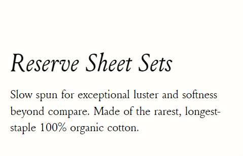
“Slow spun” is another reason to believe in the rarity and luxury of these sheets. Anything that takes time today is a luxury.
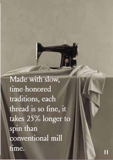
It’s not just slow! It takes 25% longer to spin! Look how Boll & Branch is saying new and intriguing things but with total brand consistency.

Still on the collection page, here we learn about the hand-finishing techniques used in the Reserve Collection. I don’t know what mitered corners are, but they sound luxurious here, don’t they?
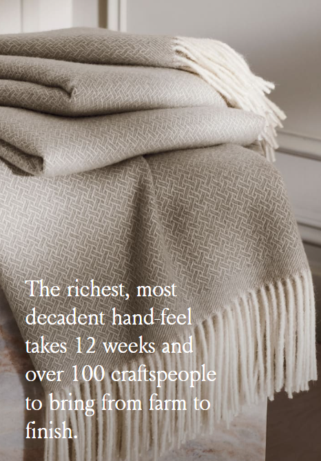
Claiming that these Reserve Collection blankets take “12 weeks and 100 craftspeople” to finish is another reason to believe in the ideas of scarcity and luxury.
Now, let’s look at the brand consistency on the product detail pages.
This is the hero section for the Boll & Branch Reserve Duvet Set.
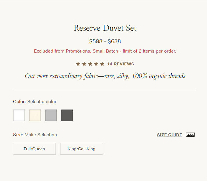
Note the limit of 2 items per order.
This is undoubtedly a flex. No one who wants a Reserve Collection duvet cover for every bedroom in their estate will be deterred by this cap on multiples.
(If you have an estate, please test this and tell me what happens!)
But combined with the “Excluded from Promotions” text in red and the reminder that this is “Small Batch”… Well, you get the idea.
Boll & Branch is sticking hard to the idea of scarcity and luxury.
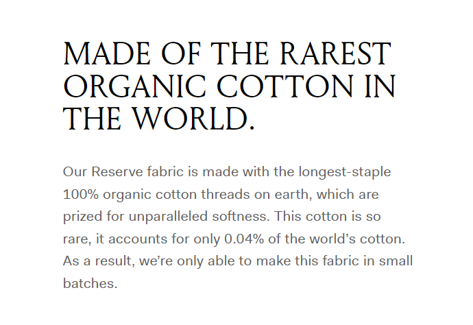
Every piece of copy on the product page doubles down on the brand idea.
Even when introducing a feature (like organic cotton), it’s framed in a way that reinforces the idea of scarcity and luxury.
This takes discipline!
Less expert marketers tend to reason that more = more. (More claims = more sales.)
It’s also much easier to wedge multiple disparate ideas into a piece of copy than it is to define a single, winning idea and write tightly-focused copy.
So, kudos to Boll & Branch for the remarkable brand consistency.
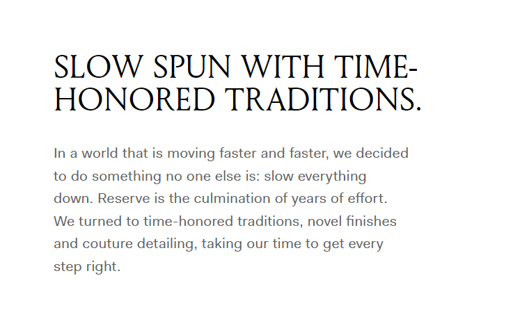
Above is another piece of copy from the product detail page.
Notice the reason why the Reserve Collection has to exist. Notice the “onlyness” claim, as Marty Neumeier would say.
Again, we encounter the core idea that time spent = scarcity = luxury.
Does Boll & Branch need more variety in the brand message?
Will brand consistency lead to consumer boredom?
For the wrong audience, yes, the Reserve Collection message will be boring.
For the right audience, it’s reassuring. But more than that, it builds desire through artful repetition.
The brand idea is arresting at first. Interesting. Attention-grabbing because it’s different.
But the idea becomes desirable with each reinforcing detail until you see and feel the product in multiple dimensions, with story and purpose, and meaning behind the click.
When I interviewed CPG startup legend, Suzie Yorke, on brand positioning, I asked her about repetition and boredom. She said:
“Our job is to get all of our target groups to be aware of our brand’s proven positioning…
What makes us stronger marketers is the discipline of saying we’re not going to venture off and be distracted by all these different messages or by what our competitors are doing.
We’re going to spend every moment and every penny on reinforcing what we know is a motivating set of brand messages.”
Exhibit 2: Single Use Ain’t Sexy
Now that our minds are in the bedroom let’s clean things up.
I first became aware of Single Use Ain’t Sexy at an eCommerce marketing conference. Now, I’m taking a CXL eCommerce brand strategy course by the brand founder, Josh Howard.
Howard hit upon the holy grail in B2C product marketing:
Incredible product idea + wicked brand messaging.
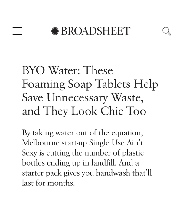
Single Use Ain’t Sexy was founded about two years ago, in 2020, and focused on a single SKU: Just-add-water soap tabs in a branded, reusable glass soap dispenser.
“At the moment, I’ve decided to make our hand soap famous, which means focusing on that as a single SKU and not fragmenting people’s attention by bringing out every other tabletised product under the sun.I want to become known as the tablet-based hand soap company. After that, we’ll bring out other products that we currently have in development.” — Josh Howard in Founderoo
Single Use Ain’t Sexy is still very small, with few marketing assets — especially relative to a brand like Boll & Branch.
That’s why it’s a good example to consider.
Early-stage startups often struggle with brand consistency because a) they’re trying to find their place, and b) great brand marketers are expensive.
Yet, startup brands need to get more ROI from each impression. And the only way to do so is to make a more memorable impression.
Let’s see how Single Use Ain’t Sexy amplifies its impact with brand consistency.
Across the website, the brand idea is consistent.
Single Use Aint Sexy is a purpose-driven brand, and that’s evident from the moment you land on the website.
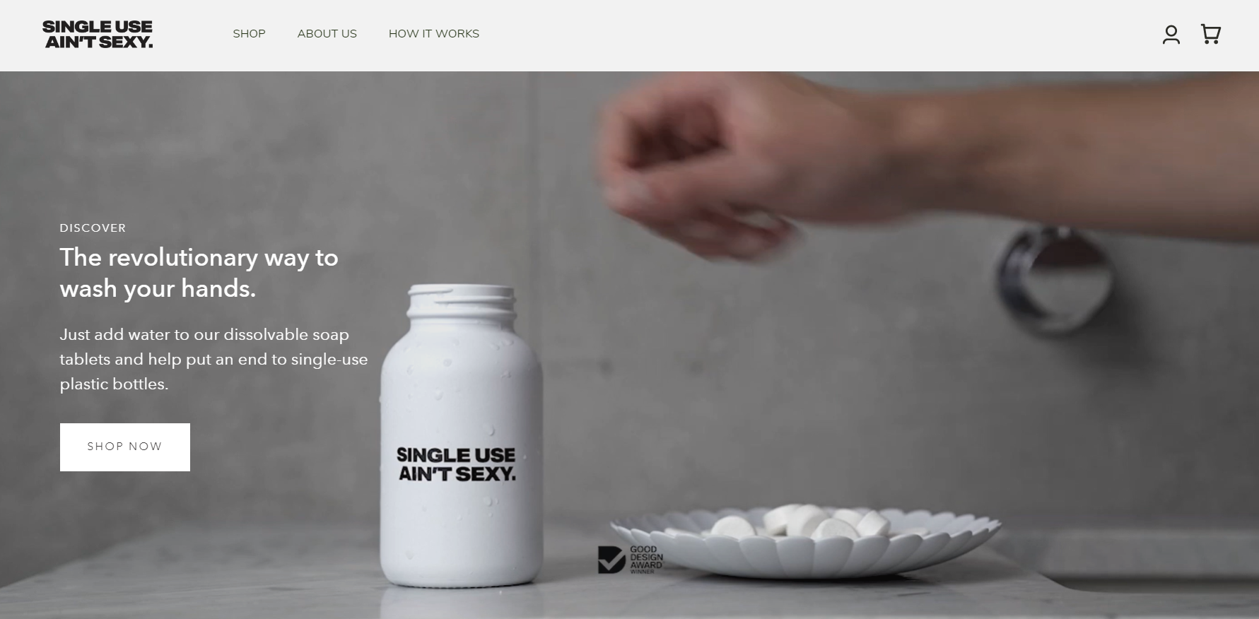
The brand idea is that we can end single-use plastic bottles by adopting a revolutionary new way to wash your hands.
It’s all you see on the website.
Single Use Ain’t Sexy could squander the brand equity earned by its amazing brand name by using more variety in the copy.
They could substitute “single-use” with “throw-away plastic bottles” or “wasteful plastic bottles”…
Instead, they exhibit brand consistency.
Here’s another example from the homepage.
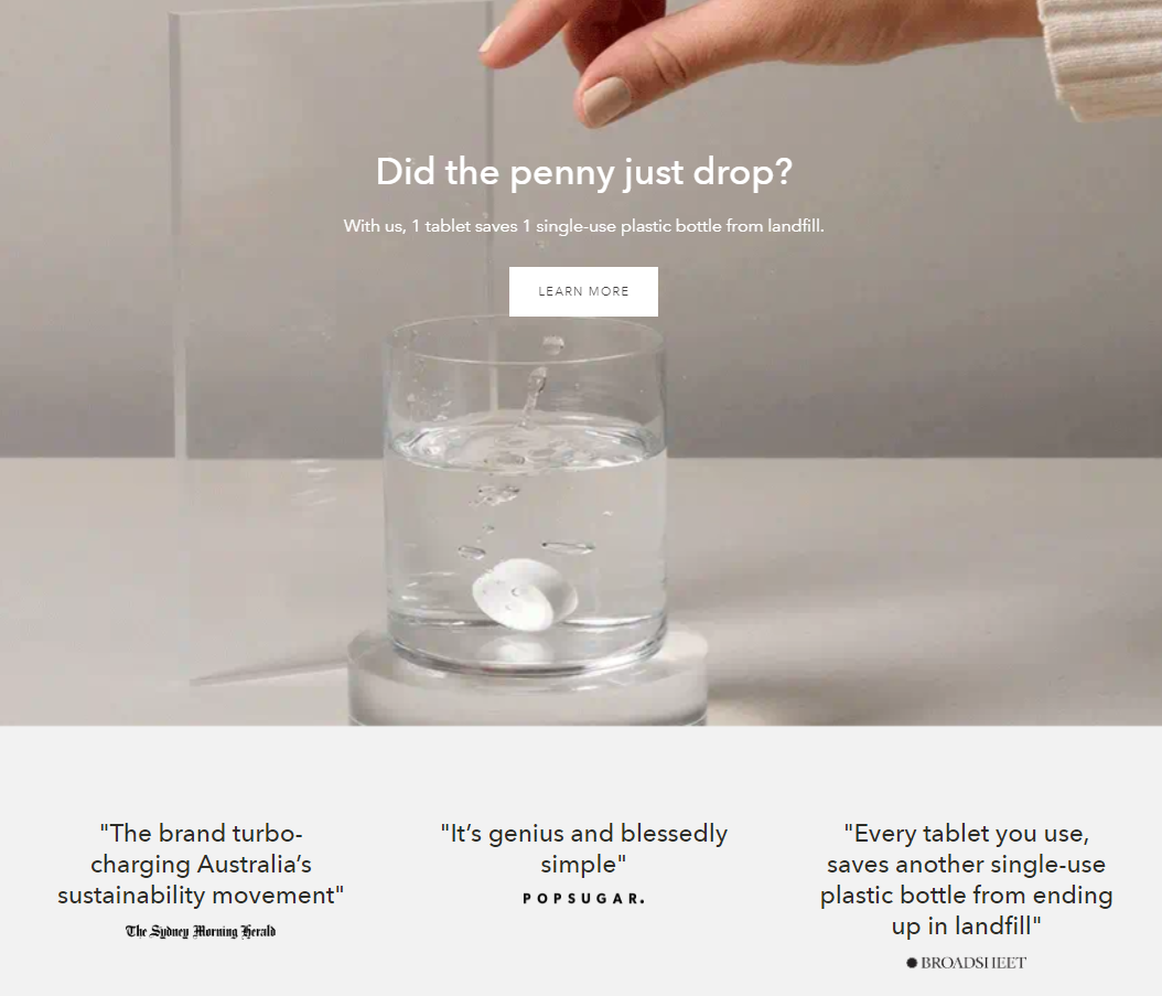
Even the choice of media quotes reinforces the core brand message.
Here’s the hero section of the Mission page:
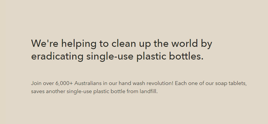
Nothing but brand consistency here.
And where other brands might be tempted to complicate the sustainability message, Single Use Ain’t Sexy keeps it refreshingly simple.
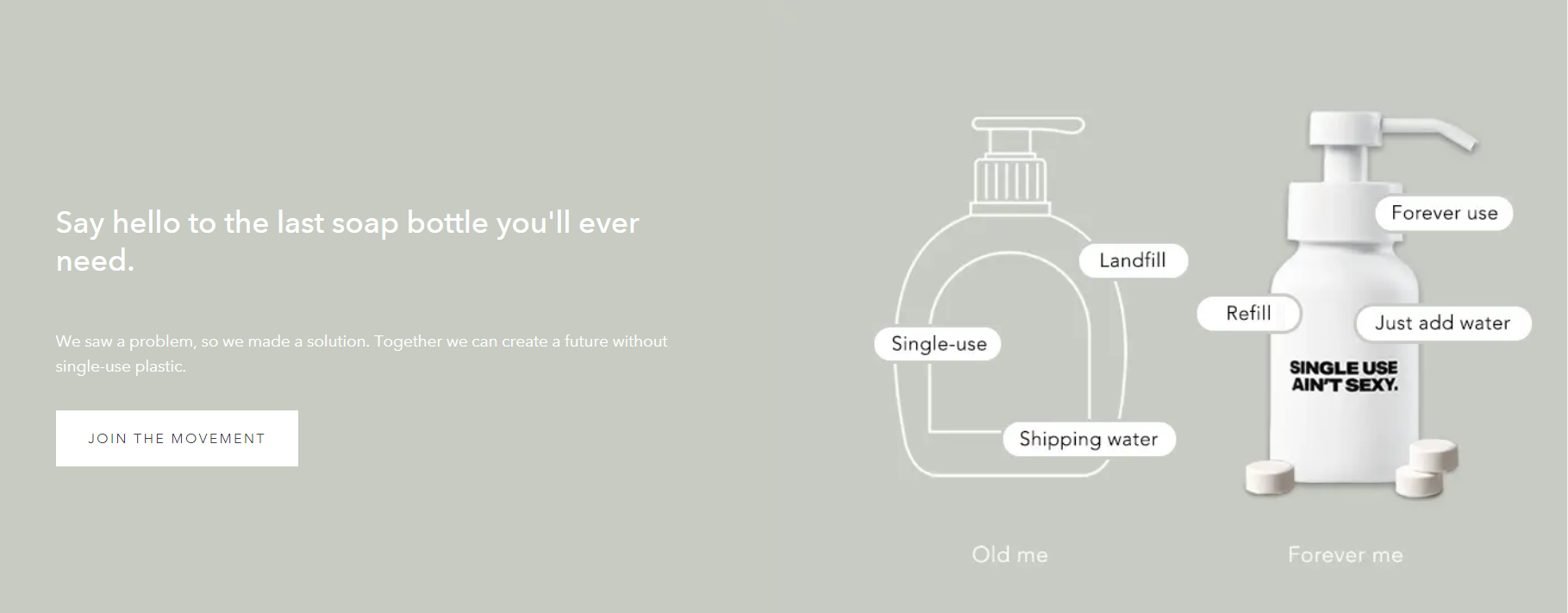
There’s no chance you can look at this website for more than 30 seconds and not leave with the big idea in mind.
Single Use Ain’t Sexy achieves memorability with brand consistency.
Emails and ads reinforce the brand idea, too.
What about off the website?
Here’s a snippet from the brand’s welcome email:

And a snapshot of the brand’s ads:
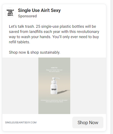
Again: replace single-use plastic bottles + use this revolutionary way to wash your hands.
Is this the right brand idea to stick to?
There are two main elements to the Single Use Ain’t Sexy brand idea:
Ending single-use plastic + revolution in hand washing.
The only way to know if these are the winning messages is through experimentation and testing. Yet, if I were to take a guess, I’d bet on the first element over the second. I’d guess that the audience is more motivated to end single-use plastic than to revolutionize how they wash their hands.
Why? Most of us aren’t that interested in changing personal hygiene practices that aren’t broken.
Yet, “revolution” is an exciting word. It appeals to a young demographic (Acknowledging that I sound like a Cat Stevens Father and Son lyric here). Revolution is more emotional than an appeal to convenience. (E.g., “Subscribe and never think about getting refills again.”) So I can understand why the brand is trying it on.
Let’s see how the brand evolves and whether Single Use Ain’t Sexy sticks with the hand-washing revolution idea.
Does Single Use Ain’t Sexy need more variety in the brand?
Will this become boring over time? Do they need more variety in the creative and copy?
Maybe, but I’d add variety with caution.
A good place to start experimenting with different brand ideas is in content. Namely, social and blog content. There, a brand can play with concepts on the edge of the core brand idea to see what gets traction.
Single Use Ain’t Sexy can also create more educational content on the blog to nurture less aware audiences.
Yet, right now, the brand should avoid falling into the trap of trying to capture everyone. That’s because Single Use Ain’t Sexy is what Graham Roberts calls a “craft brand”.
“Start-ups should deploy a craft brand strategy. To stand out, you must be utterly different to a core group of trend influencers who are frustrated with the major competitors. You must be willing to take a “high risk/high reward” strategy.
It is O.K. if your brand alienates those who are not yet ready to take on something new… Do not worry about the mass audience, and avoid trying to be too big, too fast.” (p. 61)
In other words, the initial goal of a startup brand should be to convert a hard-core set of raving brand fans. And the people poised to be Single Use Ain’t Sexy fans are already looking for ways to reduce plastic. They don’t need to be convinced that the problem exists.
That said, educational SEO content on the site could certainly help the brand to get found.
And there are ways for Single Use Ain’t Sexy to add variety while staying consistent with the core brand idea.
For example, show and tell how…
- The bottle is designed to be durable (how do I know it will really last?)
- The brand takes responsibility for the lifecycle of the bottle and the soap tablets
- It feels revolutionary to switch to soap tabs
Budget permitting, the brand could have more fun with the “sexy” angle, too. Through creative (video, imagery, copy), I’d show sexy and not-sexy soap scenarios, always with the tongue-in-cheek tone that’s characteristic of the brand.

Soap is a sensory experience, and people want to know that it feels and smells good. They might also want to know that having the branded bottle on their counter makes them look good, which is sexy.
Single Use Ain’t Sexy can also have fun attacking the alternatives by showing single-use culture as unsexy.
There are ways to extend the brand idea in creative without layering on new ideas. Being consistent with a simple idea is more powerful than being sophisticated with complicated ideas that people will forget.
So, kudos to Single Use Aint Sexy for managing the powerful simplicity with such discipline.
Exhibit 3: You Tell Me
Stay tuned for Exhibit 3…
While I prepare my examples, let me know in the comments:
What do you think about brand consistency?
What brands do you notice are remarkably consistent?
How are they making an outsized impression by staying consistent with a core idea?

