I was at Whole Life Expo in Toronto last weekend, giving a talk for a client, and I realized these shows are a marketer’s fantasy.
In the outside world, if you want to talk about your product to a total stranger for 45 minutes you’d better be Vince Shlomi.
At an expo, people will not only volunteer to hear your product talk, but they’ll also pay admission and then rush the stage to ask questions.
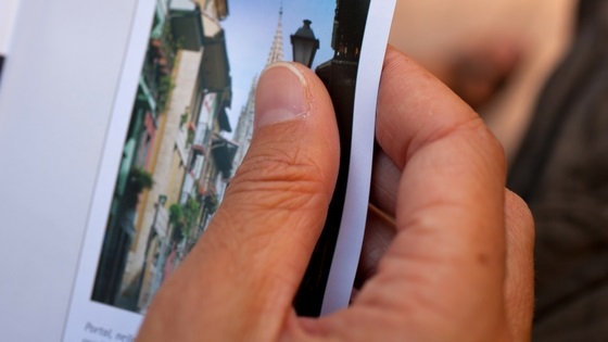
In the outside world, if you hand a brochure to a complete stranger, your piece of foldable art will at best earn a passing glance.
At an expo, people will take your marketing swag with thanks. They’ll stash it in their show bag for a leisurely look on the train ride home, and later – if you’ve done a good job – they’ll use it to look you up online.
That’s because people at expos are people in search of answers. They’re home renovators, new parents, brides-to-be, foodies, and in the case of Whole Life, people seeking natural health solutions.
They’re like eager participants in a giant scavenger hunt and your brochures are the precious clues.
Which is why if you get business at expos, your show brochure needs to be a fine piece of marketing genius. You are being given one premium opportunity to market to a motivated audience, and your brochure could be the clincher that converts a customer for life.
Even if shows aren’t in your marketing plan, don’t produce a brochure without applying these copywriting tips. Print collateral is too expensive and uses too many trees to make a throw-away.
But before the insider intel let’s talk about…
The Real Purpose of a Brochure
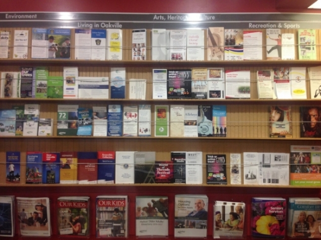
This post was in the works when I happened across a veritable trove at the public library.
Faced with a wall o’brochures, it’s easy to see at a glance what works and what doesn’t. Setting aside design it’s obvious that certain headlines are more effective, as we’ll discuss. But really, some of these brochures failed simply by misunderstanding their reason for being.
It’s clear that a brochure is not:
-
a showcase for your achievements
-
a how-to guide or technical information sheet
-
a list of your services or products
-
a piece of minimalist art
-
a photo album
-
an excerpt from your website
Your brochure is, as this blogger explains, a piece of salesmanship. It is a work of persuasion.
And persuasion begins with getting personal.
Are you Writing for Everyone? Then You’re Writing for the Blue Box
It’s been said, but I’ll say it here: before writing a word you must know your audience. Get very specific about your reader, for example by sketching out a customer avatar or buyer persona.
If possible, produce separate brochures for separate audiences. A targeted brochure is less likely to get tossed and weigh on your environmental conscience. Consider it your moral duty, then, to write a brochure that speaks directly to (and thus hooks) your reader.
For one of my clients, I write not only general-audience brochures but variations on the brochure for niche prospects. Here, for example, is a one-pager for the upcoming Women’s Show.
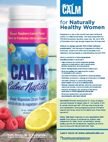
Alternately, choose a bi-fold or a single-panel brochure if lowering costs means you can create a handout that’s laser-focused on one kind of reader.
Now You Know Who…
Exactly where and when will this ideal reader pick up your brochure? If a long list is forming in your mind, stop. Pick just one setting and imagine your prospect and their first encounter.
We’ve been talking about expos, or consumer shows (only second to which are trade shows), but you may distribute at hotels, medical offices, schools, libraries, community centers or information booths. You might mail your brochures out to prospects or enclose upsell and cross-sell brochures in shipments to existing customers.

Which setting is prime for your business? Where will your ideal customers most likely and in the greatest numbers get an opportunity to snag your life-changing printed sales piece?
Do you have that setting in mind? Now, watch the scene play out.
Any small detail about the situation might inspire your headline and design choices. You’re looking to speak to that prospect where they are, in their particular headspace, just as a salesperson would modify their pitch based on the time and place.
Only you don’t have the luxury of immediacy. You’re here, at a keyboard, but your empathies need to be out there with your future reader. You want to connect because connection is a prerequisite for persuasion.
Next up, learn to focus that persuasive power.
Have a Not-So-Hidden Agenda
Like all good pieces of copy, your brochure writing should start with the end in mind; that is, start with knowing your ‘Call to Action’ (CTA).
Admittedly, many brochures don’t have a CTA. They don’t ask anything of the reader who has so patiently made it to the very last panel. Most brochures politely provide a URL and contact info and leave it at that.
But you can do better than most because you are treating your brochure as a sales piece, and that’s miles ahead of the pack.
Think about what action you would love your prospects to take. For example:
-
Opt-in to your newsletter
-
Request a quote
-
Buy immediately
-
Sign-up for a trial or a sample
-
Donate
-
Follow you on social
-
Learn the answers to their biggest questions
What’s a reasonable ask for your brochure?
Now, determine to make that ask in your brochure. But remember, the bigger the ask, the more important it is to come up with an incentive, such as:
-
a freebie for signing-up
-
access to insider tricks and secrets
-
an instant discount
-
a matched donation
-
an exclusive sampling or trial opportunity
-
the promise of a new, cool video every day on your Facebook page
Get their attention with the incentive. Prime them to enter the URL – but don’t send them to your home page.
Your home page is a catch-all and its very generality makes it a little cold for the reader of your brochure, who you will have so systematically beguiled with your brochure copy.
Instead, send the reader to a landing page built exclusively for the fulfillment of your brochure CTA. Make that opportunity to act front and center when the reader arrives at your digital home.
As an added bonus, when you use a CTA and a dedicated landing page for your brochure, you get metrics. No more guessing about the ROI of this particular piece of print.
Reel Them In
Finally, you can get started writing. That’s because you know who you’re writing for, when and where they’re reading, and the big why – your CTA.
But approach the craft of brochure copy with as much acuity as you approached the preliminaries. Good brochure copy should compel the reader forward, panel by panel, and that takes some art.
I stumbled into copywriting because I could write, in theory. I wrote long, dense, neutral, and objective prose. In fact, a better set of qualifications would have been a background in sales. Because writing to sell is more about psychology than wordsmithing.
It’s about sustaining interest and building desire, line by line. Think of it this way: The job of your headline is to get your sub-headline read. The job of your sub-headline, in turn, is to persuade the reader to give your opening line a shot.
Treat each sentence like it’s the determining factor in whether the reader sticks with you. Because it is.

That puts a lot of pressure on the headline. Can you feel it?
No wonder hundreds of posts are written on the art of the headline. You can spend a few hours studying those, but before you throw your hands up in the air at the sheer magnitude of headline formulae (like I have), here’s a simple tip.
Don’t waste the precious headline by spelling out your business, product, or service name. Instead, use the headline to draw attention to something your prospect wants or wants to solve: an alluring benefit or a tricky problem. These should be as specific to your ideal customer as possible.
In the following copy, flesh out that problem or desired future with more detail, more emphasis. Make the reader feel it and want what you have on offer.
When the reader is primed, present your solution. Then back it up with evidence and reasons to believe, particularly any that are exclusive to you. Add testimonials and answer FAQs that move the prospect forward.
Finally, tie it up with your CTA.
Brochures may no longer exist in five or ten years. But right now, in this limbo between the bygone days of print and the total dominance of digital, the brochure is still alive and kicking. Let yours go out with a bang.
If you have any questions on brochure writing or other forms of copywriting, please drop me a line.


