
This article on eCommerce homepages is a guest post by Yongi Barnard, conversion copywriter and messaging strategist.
Once upon a time, eCommerce homepages functioned practically, as the only front door to a website.
But in the world of advanced search functions, sophisticated search engines, and social media influencers, visitors may discover you anywhere and come in through nearly any page on the site.
The homepage is no longer the only front door. But that doesn’t mean it’s unimportant.
Your homepage can indoctrinate visitors in who you are, who you’re for, why you’re different, better, and why they should trust and buy from you…
Your eCommerce homepage can do all of these things. But it only will if you learn how to structure, design, and write the page to deliver on these goals.
So how can your e-commerce homepage live up to its potential? Let’s explore it, shall we?
[TABLE OF CONTENTS]
- What to Include in eCommerce Homepages
- eCommerce Homepage Headers
- eCommerce Homepage Hero Sections
- eCommerce Homepage Body Sections
- eCommerce Homepage Footers
- 11 Best Practices for eCommerce Homepages
- Create eCommerce Homepages that Convert
What Should You Include in an eCommerce Homepage?

The homepage is your company’s face to the world. Increasingly, potential customers will look at your company’s online presence before doing business with you — regardless of whether they plan to close the actual sale online. Nielsen Norman Group
Here’s the problem with a homepage: it breaks the rule of one. It’s overflowing with responsibilities.
- It’s your company’s face to the world
- It directs users to the site’s inner pages
- It boosts and solidifies trust
- It establishes your credibility
- It showcases your brand
- It provides context
- It speaks to people with different buyer awareness levels
That’s a lot to ask from one humble homepage, don’t you think?
So you can understand why the homepage isn’t always an easy one to build. Balancing all these obligations on one page turns up the pressure. It’s like filling your tiny hand luggage with all the clothes you’ll need for a 1-month holiday.
It just seems impossible.

The question:
Is there a magic formula?
How can you cram all these functions into one page?
Let’s see what eCommerce expert Nik Sharma says:
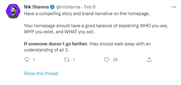
Great tweet. But it leaves us with more questions.
Which of the hundreds of products you sell do you feature? Which parts of your business do you talk about? And how? And what exactly does “WHY you exist mean?” Last time you checked, it was because you wanted to sell some stuff, no?
First, breathe.
Now, allow me to explain.
There’s no one size fits all eCommerce homepage design.
However, there are familiar elements people expect to see on a homepage. And because humans thrive on familiarity, building homepages that include these elements will make the customer experience smoother and more enjoyable.
(The better their experience is, the longer they’ll stay to explore your site. The longer they stay on your site, the more chances you have of converting them into a customer.)
What are these familiar e-commerce homepage elements?
- Value proposition
- Links to popular products and category pages
- Search bar
- Navigation menu
- Your brand story
- Social proof and other credibility boosters
- FAQ section
But here’s the thing:
These homepage elements are better understood by dividing the page into four main sections: the header, the hero, the body, and the footer.
Let’s have a deep dive into each section to find out what elements to include in each.
The eCommerce Homepage Header

It’s a small piece of real estate on your site. But there’s a lot of planning involved in deciding which elements make it to your homepage header.
A basic header section includes the logo, navigation, and search bar. It’s also a prime property for important messages that boost trust and credibility.
The Navigation Menu
The website navigation displays product categories in an organized hierarchy that makes sense to visitors.
If you run a small site, it’s easy to decide what elements to include. But when you have a big site with many categories and products, this can quickly become a choose-who’s-your-favorite-child exercise.
But this doesn’t have to be.
Find out how to organize navigation categories by asking your customers. Gather some of your ideal buyers and have them go through a card-sorting exercise that will reveal the most intuitive way to organize categories and products, so that customers find what they’re looking for.
You could also analyze your voice of customer research to find their motivations, and analyze search terms to understand what terms drive most of the traffic that arrives at your homepage. This will help you figure out which links make sense in the navigation bar.
At any rate, most navigation menus include links to the :
- main categories that people search for (check your analytics)
- pages that boost trust like the about page, shipping details page, or contact info
- highest-converting offers
- seasonal sales or deals
The Search Bar
Most website visitors who are already product or brand aware heavily rely on the search bar to get to product pages quickly. These visitors are close to buying so having a search function that supports these buyers will give you quick conversion wins.
Side note on phone numbers: Adding your phone number to the header section is a great anxiety reducer. It increases conversions & boosts trust. While you obviously need to A/B test to see how a phone number impacts site conversions, best practices maintain that a visible phone number on website headers is one of the quickest ways to turn lurkers into customers.
Some eCommerce header examples:
Joy & Glee uses a simple header that also displays important shipping information that customers need to know.

The Leather Company, a bigger website with many products and categories, has a prominent search bar, clear navigation, and a telephone number for boosting trust.

Getting the header section right on your e-commerce homepage is the easiest part. Keep it clear and simple on desktop and mobile. Help shoppers find what they need right away.
Let’s move on to one of the most challenging sections.
The eCommerce Homepage Hero Section

Many eCommerce teams struggle with above-the-fold content.
Why?
They turn to big websites like Amazon and then copy what they’re doing — which usually does more harm than good.
Amazon has brand equity. Trust, credibility, and familiarity already exist. Customers who go to Amazon’s homepage are already so much ahead in the stages of buyer awareness.
But if you’re a new store or you’re targeting cold traffic, customers often use the homepage to find their bearings and to figure out what type of site they’ve landed on.
That’s why above-the-fold content is massively important not only for capturing a customer’s attention but also for providing context.
So what should you include in this section of the homepage?
Tell your visitors what your site is about and why they should care. Aka your value proposition.
The value proposition is the ultimate reason why a customer should buy from you. It also includes what makes you different from the competition and why people should believe that claim.
Building Your Value Proposition
It may be tempting to say you’re the cheapest or have the most inventory.
Amazon already owns that. So unless you want to be pitted against a giant, refrain from making these claims.
You’ll need to undergo a little soul-searching if you don’t know your value proposition yet. Find something that only you can claim. Or at least, something you can put a stake in the ground with.
These free worksheets by MECLABS and Rutgers School of Management will set you off on the right path.
eCommerce Homepage Hero Section Examples
Here’s Last Object clearly displaying their value proposition and what they stand for in the hero section of their homepage.

Everipe also does a great job with their hero section. The value proposition immediately tells you what makes their smoothie kits different.
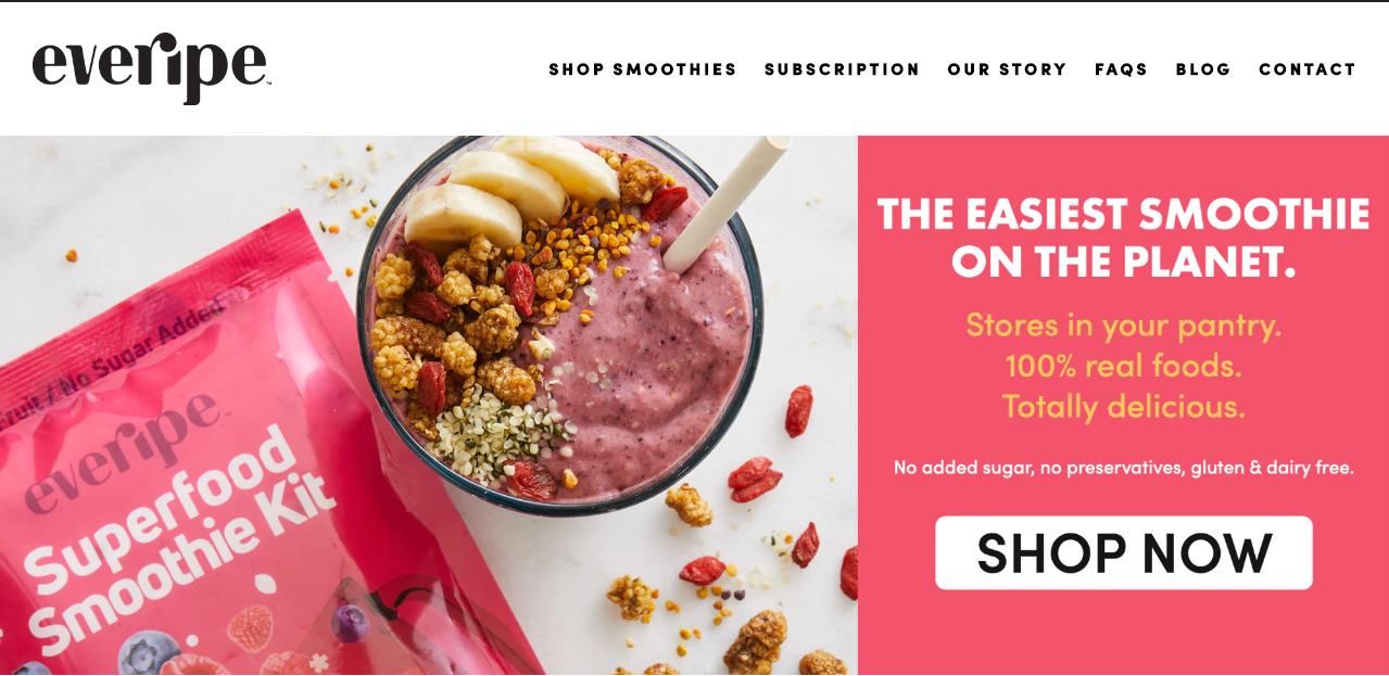
Side note on value propositions: Ideally, you want the value proposition in the hero section. But sometimes, it can also be the first part of the body section the way Olipop does it on their homepage.
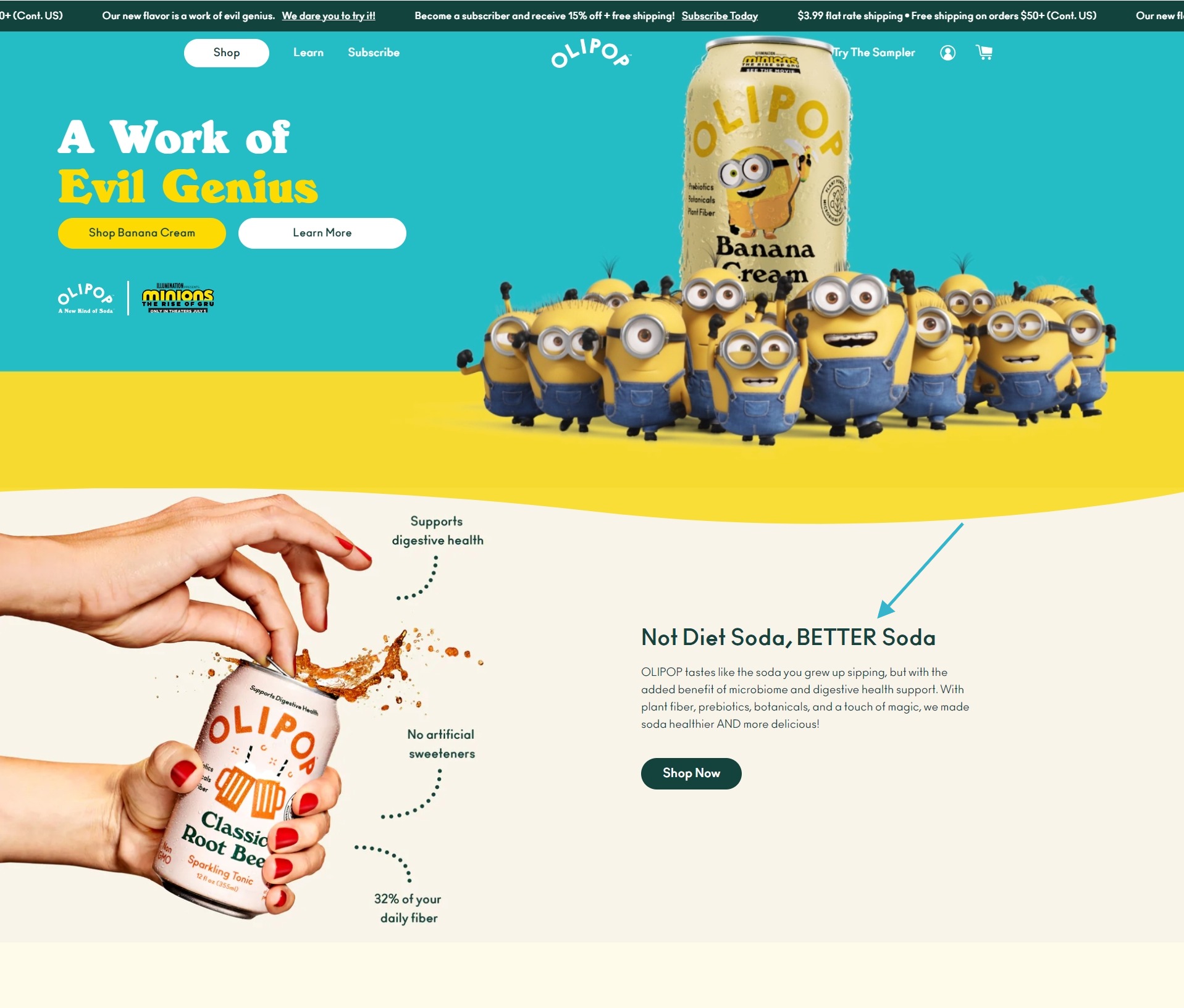
It’s important to note that your homepage hero section has to be part of your message hierarchy, which we’ll discuss below. Think of it as the top of the hierarchy.
The eCommerce Homepage Body Section

You have a little bit more freedom with the body section of an eCommerce homepage. They usually usually include a combination of the following elements:
- logo bar or social proof
- main categories and featured products
- brand promise
- details about what makes you or your products different
- FAQ section
The key factor for the body section is messaging hierarchy — which is largely driven by the voice of customer research.
What is Messaging Hierarchy?
Let me get the original conversion copywriter, Joanna Wiebe to explain:
When we’re trying to figure out what goes on a page, we’re really looking for our messaging hierarchy: the order in which to organize on-page messages to convince the reader.
This means that each section follows an order: the most important sections at the top, the least at the bottom.
Here’s Joanna Wiebe again:
“To arrive at the hierarchy, we need to start with the right questions:
- What is our visitor thinking when she lands on this page?
- What do we want her to do by the time she finishes with the page?
- How does her thinking need to change in the space between the start and the “end” of the page?
- What do we need to show and tell her to move her from where she was pre-page to where we want her to be now?”
Answer these questions and you’ll have a conversion-optimized homepage that convinces visitors to take action.
3 Examples of eCommerce Homepage Messaging Hierarchies
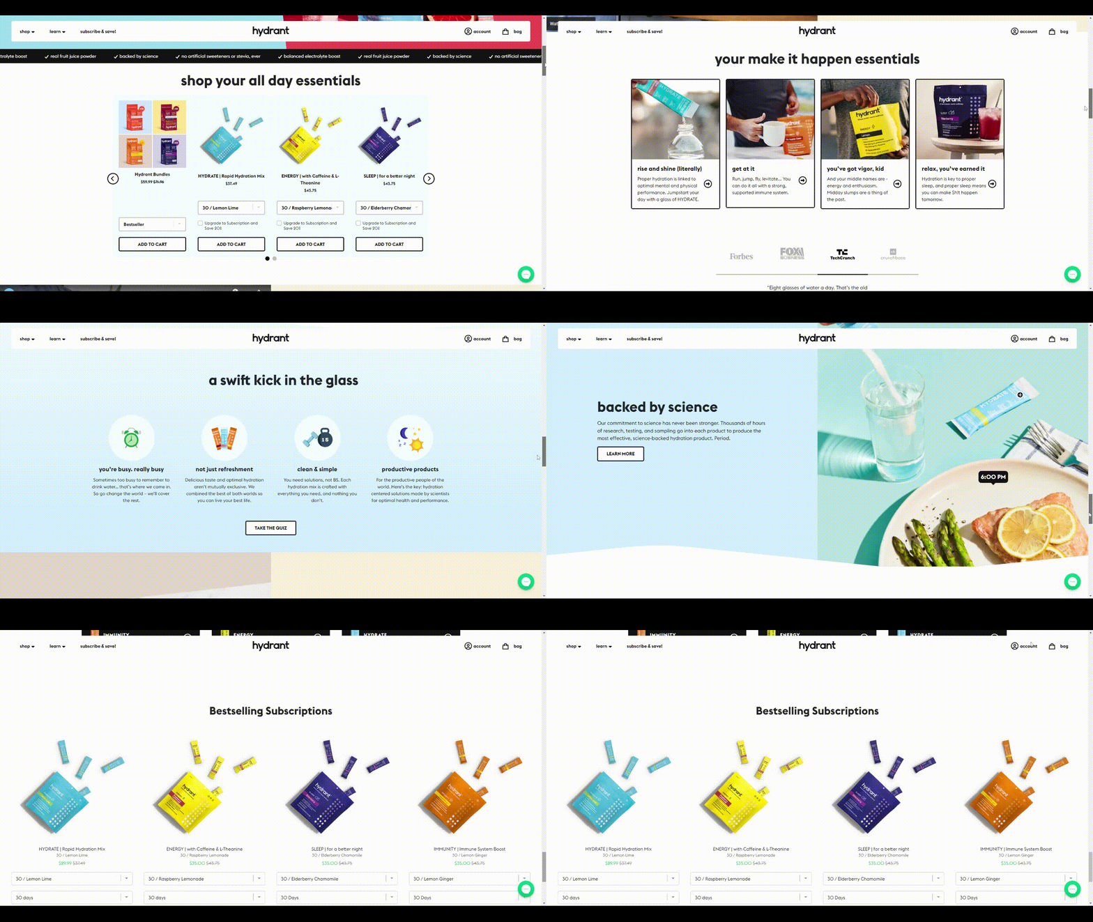
Below are examples of three ecommerce homepages that have a different messaging hierarchy based on the stage of awareness of the majority of their website visitors.
The body section of Hydrant’s homepage focuses on educating the buyer about its products by showing their brand philosophy. They also double down on differentiating Hydrant products. Then they add lots of social proof — testimonials, logos from big brands, and even scientific evidence to support their claims. The overriding aim of its homepage is to build credibility and educate cold traffic.
A bigger site like Crutchfield, on the other hand, pushes its popular products to the top of the page, and company info is pushed towards the bottom. They most likely get visitors who already know about their brand. So the most important goal of the page is to direct visitors to relevant pages.
It’s the 4th of July. It’s sale season for REI. So for this e-commerce homepage, the most important thing to do is to push the products that are on sale, then the main categories with a focus on the summer season, and towards the bottom of the section are links to popular products.

Side note: How much to include in the body section
A Baymard study shows that including 30-40% of top-level categories on the homepage gives visitors enough information to infer the breadth of your product catalog. Also consider that apart from top-level categories, you can also add links to inner pages that your voice of customer research reveals are the most important to the customers who arrive at your homepage.
The eCommerce Homepage Footer

The homepage footer may sometimes feel like a mere afterthought after you’ve put so much work into the other sections. But don’t leave anything to chance.
Here’s the thing with footers.
Most of the homepage traffic may not scroll down to it. But those who do are usually on the brink of converting. They’re usually looking for reassurance about your site. Or looking for things they couldn’t find at the top of the page.
You’ll also find methodical buyers there.
So, for your eCommerce homepage footer, add:
- links to company details
- links to important pages people might want to know like the about us page, the shipping page, and/or the returns info
- your social media links
- navigation to minor categories
In addition, the footer is where you make a last-ditch effort to become top-of-mind for visitors who are not yet ready to buy.
Because the reality is that no matter how well-optimized your homepage is, some visitors are just not ready. But it’s not a lost cause. You can still keep these visitors within your sphere of influence using the footer. You can include:
- social media sharing buttons
- newsletter sign-up forms
- user-generated content
Death Wish Coffee‘s footer is simple:

Crutchield, a bigger site with different customer segments has more to include in the footer section.
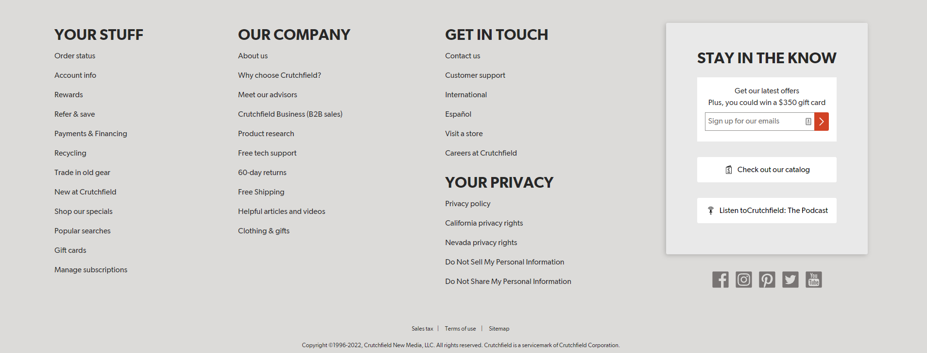
Do keep your ecommerce homepage footer clean, organized and rational. Occasionally we will see stores with chaotic footer sections and that undermines the trust you’ve built up throughout the page.
11 Best Practices to Boost Trust & Drive Sales from Your eCommerce Homepages

Knowing the elements to include on your homepage is one thing. Building a homepage that converts and boosts trust is another.
You might be tempted to jump straight into building the page.
Don’t.
As with most effective website development projects, start with the strategy. Here are some eCommerce homepage best practices to help you with this.
1. Use the power of words to move people to action
It’s the copy that “talks” to your website visitors — your online sales person so to speak. So make this a priority when building your eCommerce homepage.
But what exactly do you write? What words do you use?
Let’s start with this:
Your copy should always answer the common questions visitors have percolating in their heads when they visit your site:
- Am I in the right place?
- Who are you and what do you do?
- What’s in it for me? Is this worth my time & attention?
- Can I trust you?
- What action should I take next?
The visitor needs to quickly decide if you’re worth spending their time on. What they’re really looking for is context and relevance.
And here’s the thing with context: It’s not just a way for your visitors to find their bearings. It’s also your trump card.
Setting context helps you frame your story. In a world where it’s difficult to differentiate one product from another, framing your story gives you control over how visitors think of your business. As renowned psychologist Dan Ariely says, how a (product) is presented influences how it is perceived.
Want proof?
Meet German psychologist Hermann Ebbinghaus who opened our eyes to the world of optical illusions.

The two orange circles are exactly the same size. But the one on the right looks larger. The way we perceive things is highly influenced by their context. Much like how yelling is generally considered rude. But not when a T-rex is charging toward you.
That’s exactly what great eCommerce homepages do. They set the context and frame the brand story.
Now if you’re looking for the basics on exactly how to write great copy, that’s another blog post in itself (Copyhackers has hundreds of pages dissecting every little thing about it).
Anna (founder and chief copywriter of Conversion Copy Co. for those of you who don’t know) and I have dedicated hundreds of hours to this craft, so I’m not even going to pretend that I can teach you how to do it in 100 words.
Anna, however, already has a lot of articles on it. So check them out after reading this one.
- Conversion copywriting for luxury brands
- WIIFM? Your Copywriting Must Answer This Question
- How to write a long form sales page using the Copyhackers formulas
2. Aim to grab attention first on your eCommerce homepage
According to a study by Gitte Lindgaard et.al., you have 50 milliseconds to make a good first impression.
This means before you can blink, your visitors have already decided what they think about your business.
But here’s where this gets interesting:
This first impression is highly influenced by the look and feel of your site. So if you want visitors to think of you positively, have a design that meets the standards of your customers.
The first thing to do is to check out other websites in your industry and find the common designs that your customers are already used to seeing.
The second thing to remember is that great visual design leans on visual hierarchy, which leans on messaging hierarchy. What’s visual hierarchy? Here’s what Interaction Design Foundations says:
Visual hierarchy is the principle of arranging elements to show their order of importance. By laying out elements logically and strategically, designers influence users’ perceptions and guide them to desired actions.
More Reading Resources on visual hierarchy
- Mockplus. Golden Tips and Examples to Create Visual Hierarchy in Website Design.
- Adobe. Key Principles of Visual Hierarchy in UX Design.
- NN Group. Visual Hierarchy in UX: Definition.
3. Move visitors to other pages ASAP
Homepages may suck at selling. But they shine at directing traffic to the right page.
Think of your homepage as an airport. Everyone who enters has their own agenda. Your homepage sorts them out and directs them to the right boarding gate, so to speak.
But how do you know which pages to lead your visitors to?
Refer to your voice of customer research before designing a homepage.
Side note: There’s an exception to this. There are cases when your homepage can and should steal the product page’s thunder.
- When you have only one product and your homepage is also your landing page
- If site analytics shows that a big chunk of your homepage visitors are already product aware
4. Conduct customer research before building your eCommerce homepage
Conducting voice of customer research will reveal which elements to include on your homepage so that you’re in a better position to carry on a riveting conversation with your visitors.
As Software developer Will Harvey says, “What is research but a blind date with knowledge?”
Research will help you find the optimal messages your customers need to see. You’ll find out what the priorities are so you’ll know exactly how to get their attention and where to lead them next.
What exactly do you do when conducting VOC research?
- Analyze customer patterns in Google analytics
- See what people are doing on your site using heat maps and eye-tracking software
- Find customer pains, desires, and anxieties through customer surveys and interviews
You’re probably thinking, “Is this really all necessary? Can’t I just wing it?”
Yes, you can. And many eCommerce websites do.
But with VOC research, you’ll have data that will help you build a homepage that converts more visitors.
Next step:
5. Make sure your eCommerce homepage copy & design cooperate
Copywriters and designers sometimes go into a who’s-more-important cat fight. Copywriters say design should work around the copy. While designers say copy should follow the design.
These are irrelevant arguments, however. We should just do whatever it takes to have an eCommerce homepage that makes it easy for visitors to get to the task they came for as quickly as possible — it doesn’t matter whether that means working on the design or on the copy first.
I find that often, it’s a synergy between the two. When copy and design work together using messaging hierarchy principles, a web page becomes so much more effective than when these two departments stand on opposite sides fighting about it.
6. Regularly optimize your homepage
If you’ve already followed the eCommerce homepage best practices laid out on this page, but you’re still not getting the conversions you want, here are some questions you can ask yourself to help you optimize your eCommerce homepage and improve its performance.
- Does the copy match the visitor’s expectations?
- Are the sections arranged based on what visitors are looking for and in a way that makes sense to them?
- Does the page have enough social proof? Does the site evoke trustworthiness? Is the user experience on-point?
- Is it easy for a cold visitor who’s never been on the site before to know exactly where he is and where to go next?
Lastly, test your hypothesis through A/B testing. If you’re not A/B testing, you’re missing out on so much learning and realizations about your target customers that will massively help you increase conversions.
Even small copy changes can move the needle.
Copy experiments are my favorite ones! Super easy to setup, could bring massive returns. Hellofresh this time pic.twitter.com/T3gOn5SwJB
— Victor Bilyk (@victor_bilyk) November 11, 2021
Next step:
7. Reduce cognitive load everywhere on your homepage
People don’t usually have the time to figure things out.
They’re busy with their own lives and they will reward you with their business when you make their lives easier.
Here’s the thing: Your homepage, like every page on your site, is tasked with the job to not make people think. You want them to go through the path of purchase without a hitch.
This means lessening the cognitive load. What is cognitive load? Let me get you David Hoos from the Good.
“Cognitive load is the amount of active mental processing needed to complete tasks. In the same way that a computer will run slower when doing too many things simultaneously, your prospects’ brains get bogged down when you ask them to focus on too many things at one time.”
If you disregard this, the likelihood that your visitor will do what you want him to do on the homepage massively decreases.
So what do you do? At its very core, reducing cognitive load requires you to think about how you can streamline your visitors’ experience. You provide a smooth, seamless, and intuitive path to purchase.
More Reading Resources on Cognitive Load:
- Steve Krug. Don’t Make Me Think
- Boag World. How to Fix the Devastating Impact of Cognitive Load on your Site
- NVision Designs: Is Cognitive Load Ruining Your Website?
8. Increase page speed
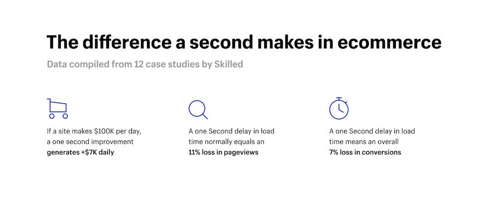
It’s not that your visitors have the attention span of a goldfish. It’s that they now have way too many more interesting distractions. And when your homepage takes a long time to load, they’ll leave before they even read what you have to say.
Imagine if this visitor came from a PPC ad. That means you’re paying for someone to click your ad only to bounce before even reading your site.
As Andrea Wabhe says, slow page speed is a conversion killer.
More Reading Resources on Page Speed::
- Kinsta. A Beginner’s Guide to Website Speed Optimization
- Moz. How To Evaluate and Improve Your Page Speed.
9. Optimize your homepage for mobile
Mobile is fast becoming the device of choice for most consumers when browsing the web. Yet it remains lagging behind desktop in terms of conversions.
The percentage of people using mobile phones will only go up. This means optimizing the mobile experience will give you a great return on investment.
10. Make the search bar easy to find on your homepage
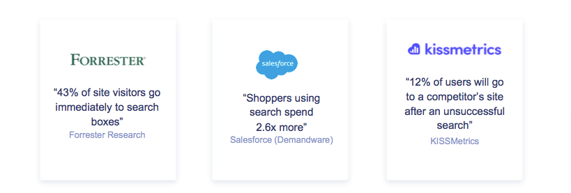
A search bar is a lot like a magic wand for ecommerce sites. And on your homepage, it’s a great tool for visitors who are already sold on your brand and just want to go to a product page.
Most likely when a person uses the search bar they already know what they want, are aware that you might be a place to get it from, or already know your brand.
In short, people who use search bars are extremely close to whipping out a credit card for you. So this should be a quick and easy conversion win. Just look at what the stats say:
More Reading Resources About the Search Bar:
- CXL. 9 Guidelines for eCommerce search.
- Algolia. Beyond the search: Advanced eCommerce Search Experiences.
- Constructor.io. Do this to maximize your eCommerce Search Bar Conversions.
11. Fill your eCommerce homepage with social proof and credibility enhancers
Andy Crestodina says it best.
“When you say it, it’s marketing. When they say it, it’s social proof.”
Social proof is the shortcut to trust and the believability factor. See Crestodina’s examples below and observe how social proof shifts the way you think about a product.
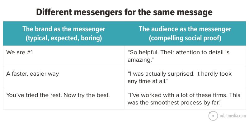
But don’t just plaster any social proof on your homepage. Use social proof that:
- supports your value proposition
- resonates with your target audience
- fosters believability
Here’s an example from the Bolton’s Naturals homepage of a celebrity endorsement that is fully aligned with their value proposition and brand:

Ready to Create eCommerce Homepages that Convert?

Now, you’ve got everything you need to create a high-converting eCommerce homepage. A page that acts like a door to your online store. A homepage that invites visitors to explore your collections… and keeps their minds off of the other stores down the digital street.
When you build your homepage with the above principles as the foundation, you’ll find that more people will stay on your site, click relevant links, and buy more of your products.
If you need help creating your eCommerce homepages, or optimizing an existing homepage to convert, you also know who to hire: a conversion copywriter. Optimizing homepages and other key marketing assets to convert is our specialty.


