In this post I talk about what to consider when choosing your email marketing design.
Talk to any digital marketer, and you’ll hear ‘the money is in the list’. This simply means that email is one of the most effective forms of marketing available to businesses.
Today, I’ll be talking about three approaches to email marketing design, how and why they work in different scenarios. Specifically, I’ll focus on:
1. A deliberate text-only strategy (all copy, no design),
2. A DIY approach to email design, and
3. Using professionally-designed, branded email templates.
Why design tips from a copywriter?
I’ll be the first to admit that words only get you so far. I can write my very best copy, but if the web page, ad, video, slide deck or brochure is poorly designed, very few people will read or take action.
When it comes to email marketing, there are exceptions.
Some world-class email marketers get fantastic results from plain text or basic design emails. And when I talk about results, I mean open rates, click-through rates, sales and email list growth.
1. Simple Email Design
I’ve seen a deliberately simple approach to email design work very well for B2B companies, in software and information marketing especially. Often these include only a logo or plain text.
Here are two examples:
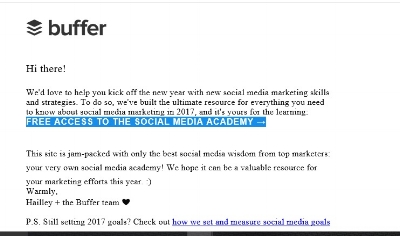
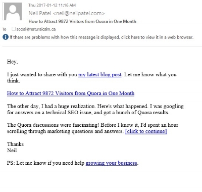
A typical, very basic email from Buffer, makers of social marketing software.
Three Characteristics of Successful Plain Text Email Marketing
If you think a plain text approach to email marketing might work for you, here are three things to keep in mind:
1. Can you put a face behind the email?
2. Can you segment your email list?
3. Is your audience interested in information above all else?
Before I delve in, it’s important to note that this kind of email marketing isn’t a shortcut. It may look simple, but that simplicity hides sophisticated strategy.
Putting a Face Behind the Email
Brands that eschew fancy email design are often operating on the ‘friend’ principle. Their emails are intended to seem personal.
Often these are ‘personality brands’, like that of Neil Patel. The brand is built around his persona. But some brands, like Buffer, put a face behind their voice by using staff personas, like Hailey’s.
Segmenting
‘Segmentation’ allows you to separate out subscribers based on their behaviour. Where did they sign-up? When did they subscribe? What have they clicked before? Different segments receive different messages.
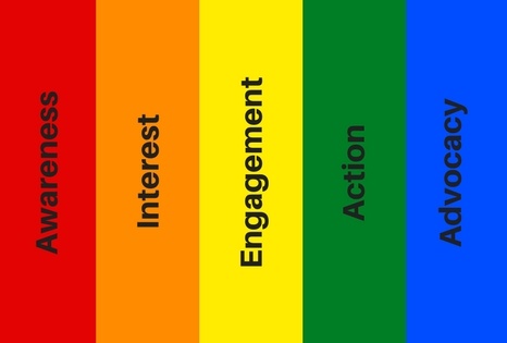
Segmentation allows email marketers to create more relevant, targeted email marketing with the illusion of personalization. It allows us to speak to people where they are in their journey from Awareness of the brand through to Advocacy.
Brennan Dunn is an expert at this approach. His messages appear highly personal, timely and relevant. But Brennan isn’t crafting spontaneous and casual emails like you would to a friend.
His messages are automated, as in, planned and written in advance, and issued as part of a series.
But Brennan realizes that not every new subscriber is in the same place. He knows that a new subscriber needs newbie information, in a progression they can handle. And so when he receives a new subscriber, that person doesn’t receive the same message that his long-term subscribers receive.
Unlike Buffer and Neil Patel, Brennan doesn’t often send people directly to a blog post. He shares the content end-to-end in the body of the message. This makes the email seem even more personal.
What does this have to do with design? If his emails were more visually slick, that illusion of personalization would burst. Our friends don’t send us professionally-designed emails.
Information Above All Else
Marketers like Brennan are selling to people who need serious information, not entertainment. They’re in a hurry, reading on their phones, and they don’t have time for graphic interruptions. This is really the key point. Know your audience and how they want to consume your content.
When you do this well, you create an audience of subscribers who are conditioned to open your emails in anticipation of highly useful content.
ConvertKit for segmenting and simple email design
If you love this approach to email marketing, check out our post on ConvertKit. In it, we run down why this software makes it easy to grow your list and send more emails like a pro.
2. DIY Email Design
MailChimp and other email software make it easy to churn out self-designed campaigns. You can drop in images, logos, play around with the fonts and colours.
However, without a designer, these can still look DIY – which is not necessarily a bad thing. Amateur email design can work well for certain businesses.
Here are three considerations:
- Do you produce interesting visual content, like photos or original art?
- Does your brand suit a DIY look? Are you artisanal, local, or low-tech?
- Are your subscribers just as interested in what you stand for as what you sell?
For example, Renae’s Pantry is a shop in the town where we lived in Australia. Run by a charming couple with a knack for photography, they sell ethical groceries, locally grown, and hold events in their lush, tropical space.


We moved back to the GTA a year ago, but I still read Renae and Ben’s emails – even though I can’t attend their events, and I can’t buy their groceries.
That’s because Renae’s Pantry has achieved the holy grail of digital marketing: they’ve created community.
When customers have a sense of belonging to a brand like this, they aren’t looking for emails with slick design or big discounts. They’ll snap up what the brand has to offer – whether it’s a newsletter, a product or a service – because it speaks directly to something emotional. (In my case, nostalgia.)
A community doesn’t develop overnight, but you can nurture it with email by taking cues from Renae’s Pantry.
- Share stories
- Include meaningful, high-quality images
- Give profile to customers, partners and staff, in that order (the more other-oriented, the better)
To view an actual example of Renae’s emails, click this link. See what I mean?
3. Professional Email Design
Are you like one of the brands above, or should you pull out all the design stops?
Highly-designed, HTML emails are typical of e-commerce brands.
Ultimately, it comes down to a branding decision. What are you trying to convey? How can you best communicate that through a combination of copy and design?
Thinking it through End-to-End
Let me share an example of how I decided we needed to go pro with a client’s email design.
Natural Calm Canada is a national supplement brand, but they meet some of the requirements for a DIY email design:
- Like Renae’s Pantry, Natural Calm has a community – a core group of customers and retailers who are crazy for the brand.
- They also have a founder who’s well known in the natural health industry.
- The founder and her husband are in beautiful Kenya half the year, working with their charity. (Great stories, great photos.)
But there are other factors:
- Unlike Renae’s Pantry, not everyone on their email list has a personal connection. Most people discover the brand on retail shelves and aren’t aware of the social good aspect.
- Natural Calm is in the consumer packaged goods industry, where the bar for design is set high.
- It’s important to create continuity in experience online. What customers see on the website should be mirrored in email design.
Recently, Natural Calm had a huge spike in email subscribers from a single landing page that I wrote. Some of the success can be attributed to the copy. But I think we can agree that my copywriting on a less attractive page wouldn’t have moved the needle quite so far. This is a good looking landing page! And the subsequent emails must be just as well-designed.
How We Procured a Beautiful Email Template
Natural Calm needs to cultivate a relationship with these new subscribers before they lose interest. We need to move them along the spectrum illustrated above by sharing valuable health information, user tips, success stories, and, yes, exclusive offers.
But how to make the emails as appealing as that gorgeous landing page? I knew we needed expert design, fast.
To get it, I went to Mail Bakery. This design shop specializes in email templates. You choose a package, share your specs, and they turn around an HTML email template in short order. Here’s what the new Natural Calm emails look like.
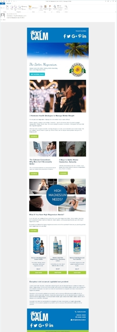
Fabulous, right? The Mail Bakery people nailed it on the first iteration. They’re true email design experts.
Form Follows Function
You’ll notice this email template is designed around content. We’re sharing three blog posts in the mock-up above.
Why is this significant?
Marketing emails can be designed to do a few things:
- Showcase fresh products
- Offer regular discounts, giveaways and contests
- Deliver appealing content
The layout and design of the email template will be different for each, so think it through before you brief your designer.
#1 works for brands with a steady supply of new products. Think apparel, big e-tailers or product curators. #2 works for brands that thrive on discounts.
Natural Calm is neither. Instead, our emails are designed around content. We aim to educate subscribers on why and how Natural Calm works (again, moving them along that rainbow spectrum towards ‘Advocate’). And, of course, we’ll show our appreciation with a sprinkling of deals.
Isn’t this the same strategy employed by the information marketers and software brands with their plain text emails? Yes, and no. Both emphasize content, but the audiences are different.
Natural Calm’s readers are consumers. Chances are they’re reading at leisure, not in a rabid quest for answers. To make that reading experience more enjoyable, and stickier, we couch the email content in graphic design.
To Summarize
No one email design strategy fits all. When choosing your approach, consider:
- What value you’re offering and how you can sustain a steady drip over the long-term
- How that value will further your bottom line
- Your subscribers’ stage of awareness, expectations and reasons for subscribing
- Where and how your subscribers read
Once you know your strategy, choose an email design to match.
Questions? Please drop me a line.


